After creating my first poster, some improvements were in order. I received two main criticism of the first poster.
The first one being the header font is not working well. The italics style of the font is too harsh and a bit hard to read.
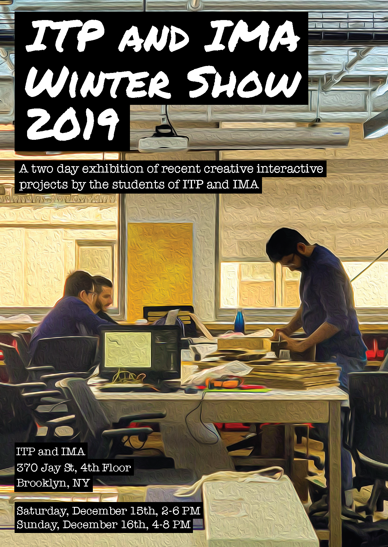
The second criticism I received is that the image is somewhat too busy, and the work that is being done is not well showcased.
I try to address the first criticism by changing the font to a less italicized one. I still want to use a “handwritten” font for the header to contrast the typewriter font I’m using for the text.
As for the issue with the image, I wasn’t able to take another image that I liked (plus, I fell in love with the first image already, I think this is bad). Instead, I chose to zoom in the image a bit to give more attention to the people working.
Here is the second iteration of my attempt at the ITP Winter Show poster.
