An Attempt At Personal Branding

Here is my attempt at creating a personal brand.

I first started with a personal logo. I wanted to create something that is based on typography. There are two options I could go with the wording for the logo. The first option is “tirtawr”, which is the handle I use almost everywhere. It is the address of my website, my username on github, twitter, everywhere. The second option is to use “T.W.R”, which is my initials. My full name is Tirta Wening Rachman. Furthermore, I also know that I want to use a handwritten typeface to introduce some whimsy.

Here are some of my early tries.

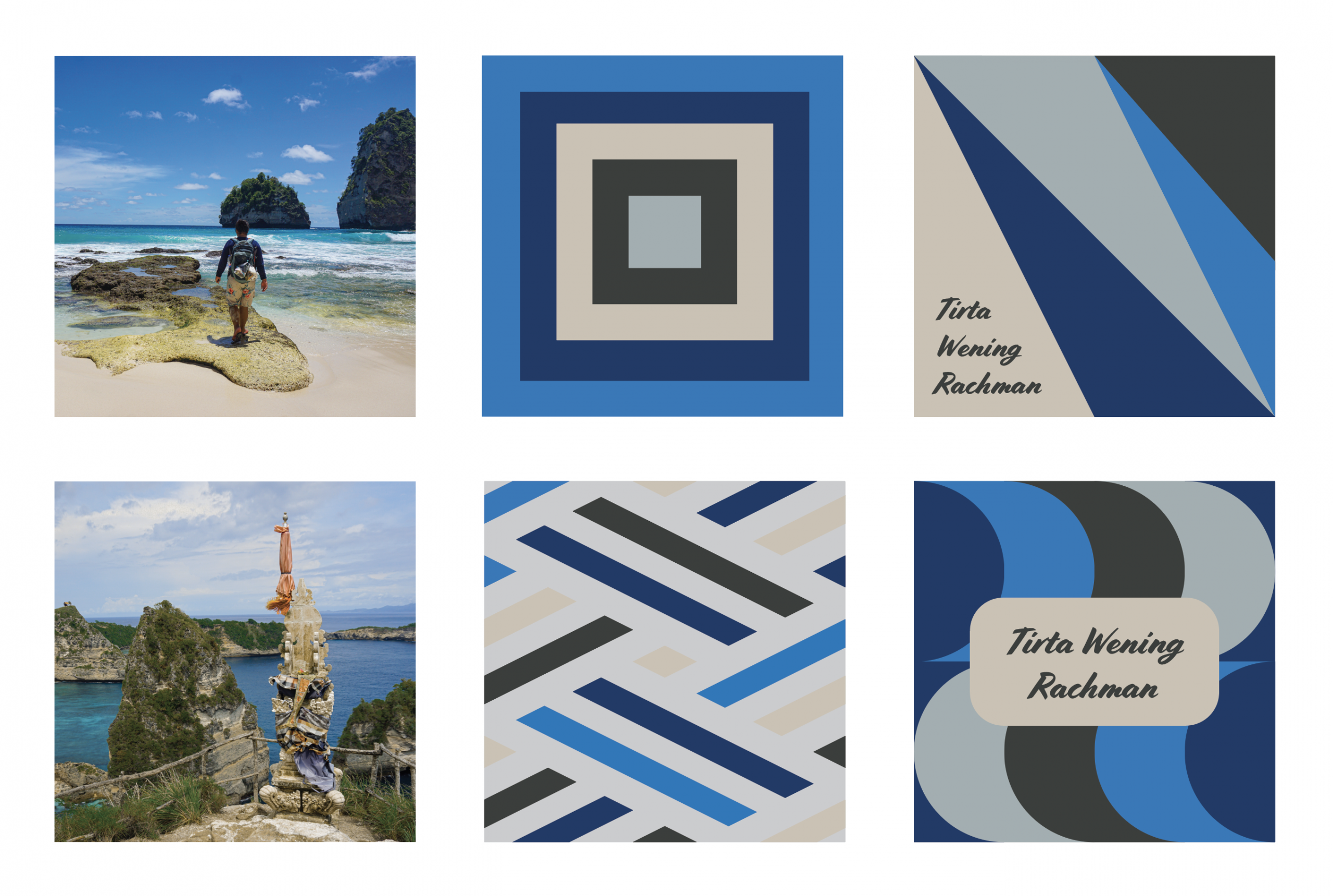
After spending some time trying out different combinations and colors, I landed on three logo candidates that I quite like. It is written using the Chelsea Market typeface. I also added some decorations to go along with it.

The three main candidates

I ended up gravitating towards the one in the middle due to the vertical symmetry. And I also like it because to me it looks both professional, yet it also has some whimsy to it.

Chosen logo

Continuing on, I wanted to along with the personal color palette that I’ve created for myself.

Color palette

During that previous project, I’ve also created some compositions that go along with the palette. However, something that I noticed was that the font I used for some of the compositions only works well on certain scales and is not friendly for the web. This has to change. I updated the illustration to use the font that I’m using for my logo.

Original compositions based on my personal color palette
Updated compositions based on my personal color palette

Lastly, what I wanted to do is to create some font pairings to go along with my logo. I used FontJoy to help me create the font pairings that I need. I landed on using Roboto Mono and Cousine to go along with Chelsea Market. My logic is that I wanted to contrast the “handwritten” logo/title with a monospaced font for the text and heading, showcasing my programming background.

Screenshot from FontJoy

Looking back, this was a fun project to do. The final result definitely is not perfect in any way, and I’m accepting feedback. Leave a comment below if you think I can improve this in any way. Cheers!

Plants on Plants on Plants on Plants

This week’s fabrication challenge is to create something out of two different material that is not plywood nor acrylic.

My idea is to create something out of natural materials. The first thing that popped into my head was wood and cork. However, after some soul searching, I landed into an idea to create a plant vessel that is made entirely out of plant-based materials. I made my plant vessel out of bamboo, cotton, cork, paper, and ceramic.

Starting Materials

I started with a pre-made bamboo box and tried to wrap some cotton cloth around it and fasten it with glue. This proved to be harder and more time consuming than I thought.

Gluing the cotton cloth into the box

After the cotton was successfully wrapped around the box, I cut some cork to put on the top and bottom as decoration. The bottom piece I cut using a sharp knife, and the top piece I cut using the laser cutter. I wanted to play around with different methods to try to understand how the material responds.

Box with cork put on top and bottom

After the glue on the cork is set, I put some succulents inside. The succulents already come with a ceramic pot, and I thought that it played well with the theme so I decided to keep it. Also, I added some crumpled brown paper to serve as a filler. Originally I wanted to use little rocks, but I wasn’t able to procure it in time.

This is what the final product looks like. I’m pretty happy with the result. This will live in my room from now on.

My Second Poster

After creating my first poster, some improvements were in order. I received two main criticism of the first poster.

The first one being the header font is not working well. The italics style of the font is too harsh and a bit hard to read.

The second criticism I received is that the image is somewhat too busy, and the work that is being done is not well showcased.

I try to address the first criticism by changing the font to a less italicized one. I still want to use a “handwritten” font for the header to contrast the typewriter font I’m using for the text.

As for the issue with the image, I wasn’t able to take another image that I liked (plus, I fell in love with the first image already, I think this is bad). Instead, I chose to zoom in the image a bit to give more attention to the people working.

Here is the second iteration of my attempt at the ITP Winter Show poster.

My First Poster

This is my first time creating a poster. It is a poster for the 2019 ITP and IMA winter show.

I had fun trying this. My general idea is to showcase the process of the work that is going down here at ITP, and also the people doing it.

First design
Alternate design

My First Enclosure

This is my first time creating a prototype for an enclosure. To do this, I walked around my local 99 cent store to find some inspiration. Luckily, I was able to find something that sparked my curiosity pretty quickly. I found a sunglass case that is perfect for this project. It is made out a semi-soft material, and I’ve never played around with that material before. No time like the present to try new things!

My general idea is to create a controller-like device that can house components on the inside. I want buttons that can be pressed comfortably when the device is held with both hands.

The first thing I did was to remove the strap and the zipper head to make the case more streamlined.

Strap and zipper head removed

When life gives you lemons, you make lemonade. Sadly, sometimes when you order lemons online, it comes in late. I had ordered a variety of buttons from Adafruit that was supposed to arrive on Sunday, September 29th. However, the delivery gods decided otherwise, and my package still hasn’t arrived today (Tuesday, October 1st). Thankfully, my angel of a friend Lanni gracefully lent me two of her buttons so that I can (sort of) do this project in time.

Buttons from Lanni

I started with creating cutouts for the buttons on the sides of the enclosure. Dealing with this semi-soft material is quite different than wood. It somewhat easier in the sense that I can just cut it with a sharp knife. Though it is also harder in the sense that I can’t really use a drill to make a hole, so I have to do all my work manually.

Cutouts cut using a knife

After creating the cutouts, I mounted the two buttons that I had on the holes. I also made a slit on the other side so that I can pass a cable through. After that, I was pretty much done, since I ran out of things to mount.

All components mounted
The final product, it looks like a lizard
A picture of a picture of a picture of a picture of a picture of the controller
Controller in action

If there’s one key thing I can take from this experience, it is to always have a backup plan. I was lucky enough to find someone kind to lend me her buttons, next time I might not be so lucky. But I guess it’s better to learn this early on rather than later.

False Interactivity

The prompt for this assignment is to “Pick a piece of interactive technology in public, used by multiple people. Write down your assumptions as to how it’s used, and describe the context in which it’s being used.”

Rather than picking a piece of interactive technology, I’ve found something that looks interactive, but in reality, it is just a one-way form of media. It is the big screens we can find on a lot of NYC’s subway stations.

Screens on the right spotted at DeKalb Ave subway station

Most of the times the screen would display either a subway map, information about planned work on the subway system, or train arrival information. However, sometimes they also show advertisements.

When displaying advertisements, it is pretty obvious that these monitors are merely displays and are not meant to be interacted with. But when it is actually displaying helpful information such as the timetables, or the subway map, it looks as if the screen is meant to be touched by the commuters. The design language is consistent with those kinds of screen that have touch interactivity.

Children trying to touch the screen

I visited a number of subway stations and stayed for about 15 minutes at each of them. With the exception of one station, I was consistently able to find someone trying to touch the screen to see if it is indeed a touch screen.

Train arrival information

I think it’s the glass-like coating on the screen and the way it is positioned that makes it look like it is interactive. Some of the pages displayed also is using the design language of a mobile application. For example, when displaying arrival information of subways, it displayed in a way that is almost as if one can scroll down to see more information.

It is interesting to me how we are now at that point where interactivity of media is now completely expected. Interactivity is no longer something new or groundbreaking, it is rather something that is expected by society.

Personal Color Palette

This is the color palette I have chosen for myself. In my opinion, it is elegant, modern, effective, and somewhat understated. Along with it, I have made a set of six compositions using my color palette. Two of them is an edit of photographs using Lightroom, another two are random geometric patterns that showcase the colors, and the last two are designs for a possible personal logo for branding purposes.

Compositions

New Toy: Laser Cutter

This is my first encounter with the laser cutter. I wanted to create something simple and beautiful. I also wanted to create something that I need. I made a mistake in the past of creating something that I don’t need, and now it just sits there in the corner doing nothing. After considering everything, I’ve decided to create a key bowl. My idea is to create an increasingly larger set of rings using the laser cutter, and then glue them together to create the bowl.

I started my first prototype using cardboard. Mainly because it is free and it is very forgiving. Since the cardboard is pretty thick, for my first prototype I am using only three rings.

First cut in the laser cutter
First prototype made out of cardboard

The first prototype was a success! It looks exactly like how I wanted it. It gave me the confidence in moving forward with the material I want for the final product – wood.

Since the wood that was available to me was not as thick as the cardboard, I tripled the number of rings from 3 to 9. I also enlarged the bowl a bit because the prototype was too small.

Final material after cutting

After cutting the wood on the laser cutter, I glued them all together using wood glue applied with a paintbrush. After letting it try for 12 hours, I have to say I am very happy with the final result. I decided not to paint or finish the wood because I really like the gradient that the laser cutter left on the wood. I am definitely going to use this bowl every day.

Prototype and final product side to side
Final Product after gluing

Creating A Sound-walk

After embarking on a sound-walk we were challenged to create a sound-walk of our own. The project was done in a group of three. I did it with Bomani and Sammy. The piece can be accessed in this link.

We started out by doing a brainstorming session. We were able to come up with roughly 30 ideas. We took note of the strong ones and started formulating not only the story that we want to deliver but also how we want to deliver it. The end result of this process is a script.

Once the script is ready, we started recording and to look for free sound samples that we could use throughout the internet. All three of us are voice acting in this piece. To make it more “natural”, we decided to do three full recordings; one with each one of us in the mic.

After the recording is done and all the samples are gathered, we started to edit using Adobe Audition. None of us had ever touched Audition before, but personally I find to be quite intuitive and relatively easy to play around with. It was fun.

Throughout the editing process which takes roughly 4-5 hours for a 3-minute piece, we found some missing and out of place things in the recording. To remedy this, we did another round of recording and tweaked the story a little bit to make it more cohesive and flows more naturally.

One of the things that we wanted to experiment on is to have the listeners interact with the piece in a way that transcends the listener from an audio-based world to the physical world. We did this by asking the listener to draw a picture at the end of the piece. At first, I was quite skeptical of this experiment, but after going through it, I am extremely glad that we decided to go through with it.

Looking back, this project involved a lot of effort, compromise, and tweaking around. It was a super fun project to do, and I am very proud of what we have created.

To actually enjoy what we’ve created, visit this link. You can start listening on the elevator lobby of 370 Jay St.

Redesigning A Boarding Pass

Today’s experiment is to re-design an old boarding pass from Delta Airlines.

Old Boarding Pass

There are two things I wanted to achieve in the design:
1. To have a clearer hierarchy and organization of information
2. To have a more legible text
3. To make it a bit more aesthetically pleasing

Here is my design. I edit it using Google Slides.

Edited Boarding Pass

On the larger side of the boarding pass (to the left of the perforation), I tried to split the information into two sections. On the left is information that is more important to the passenger, while on the right is information that is more important to the operations crew. The passenger related information is also duplicated on the small tab to the right of the perforation.

I also changed the text to make a clearer distinction between the labels of information versus the information itself.