Time Sketch #4: Calculating People Receiving Sunlight

Rovelli in his book “The Order of Time” spent a whole chapter talking about how there is no “one present”. Each point in the universe move through space in their own time and has their own “present”. But in practice, we as humans have observed this “one present” ever since we can observe time.

We know that at any point, roughly half of the surface of the earth is receiving sunlight, while the other half is blanketed by darkness. One may assume, that at any one time, half of the world’s population is receiving sunlight, while the other is not. But the world’s population is not distributed evenly. We, humans, have a tendency to gather together, forming cities. I wanted to create a tool to measure how many people are receiving sunlight at any given time.

General Workflow

Here are the steps I used to calculate the number of people receiving sunlight at any given time:

  1. Split the earth into a 360 by 180 “grid” where each cell is the size of 1-degree longitude by 1-degree latitude, and calculate how many people are residing in each cell.
  2. Figure out which cells are receiving daylight at any given time.
  3. Calculate the number of people receiving daylight by adding up the population on the cells that receive daylight.

Step 1 – Gathering Population Data

Fortunately, I happened upon NASA’s Dataset of Gridded Population of The World. However, the dataset is extremely large (it’s a 3.5 GB CSV file). It would take a long time to calculate if I am to use this dataset directly. So I had this idea of aggregating the data into a 360 by 180 “grid” where each cell is the size of 1-degree longitude by 1-degree latitude, and calculate how many people are residing in each cell.

I used the Node.js script below to aggregate the data:

const Fs = require('fs');
const CsvReadableStream = require('csv-reader');
const AutoDetectDecoderStream = require('autodetect-decoder-stream');

let inputStream = Fs.createReadStream('source.csv')
  .pipe(new AutoDetectDecoderStream({ defaultEncoding: '1255' })); // If failed to guess encoding, default to 1255

// The AutoDetectDecoderStream will know if the stream is UTF8, windows-1255, windows-1252 etc.
// It will pass a properly decoded data to the CsvReader.

const result = [];
for (let i = 0; i < 180; i++) {
  const row = []
  for (let j = 0; j < 360; j++) {
    row.push(0)
  }
  result.push(row)
}

let n = 0
inputStream
  .pipe(new CsvReadableStream({ parseNumbers: true, parseBooleans: true, trim: true, asObject: true }))
  .on('data', function (row) {
    n++
    const population = row['UN_2020_E']

    if (population > 0) {
      const lng = Math.floor(row['CENTROID_X'])
      const lat = Math.floor(row['CENTROID_Y'])
      const lngIdx = lng + 180;
      const latIdx = -lat + 90;

      result[latIdx][lngIdx] += population
    }
  }).on('end', function (data) {
    console.log(JSON.stringify(result, null, 2))
  });

Using this method, I was able to reduce down the 3.5 GB CSV file into a 400KB JSON file, and reduced the lookup time from over 3 minutes to mere milliseconds.

Step 2 – Generate a GeoJSON Polygon of Darkness in the Earth

So before I could calculate the population, I first need to know which section of the earth is receiving sunlight at any given time.

Thankfully, someone did this for me already. I found a GitHub repository of someone creating a night-time overlay on Google Maps API v3. Through some complex math that I don’t particularly understand, they were able to calculate the exact position where the sun is perpendicular to the earth at any given time. Using that point, they then calculate where the centroid of the “darkness” is. Then they used that position to cast a circle on the surface of the earth’s sphere using some rudimentary geometric calculation.

I adapted their code a little bit because I wanted to use GeoJSON format instead of Google Map’s API. I mainly used turf.js to perform the necessary transformations.

Here’s the javascript module that I ended up with to obtain a GeoJSON polygon of where the earth is experiencing darkness.

Step 3 – Calculation

I was yet again lucky enough that turf.js has a helper method called booleanPointInPolygon which determines whether or not a geographical coordinate exists within a GeoJSON polygon.

This makes it relatively easy for me. All I had to do then is to just iterate over all the cells and add up the population of the cells where it doesn’t fit inside the darkness polygon. Here’s the javascript module that I ended up with.

Caveats

Since the data is aggregated on a 1-degree longitude by 1-degree latitude grid, there was some level of resolution loss. The earth rotates 1-degree every four minutes, and at the equator, it amounts to about 100 kilometers. Therefore the largest cell would be about 10,000 kilometers squared.

Result

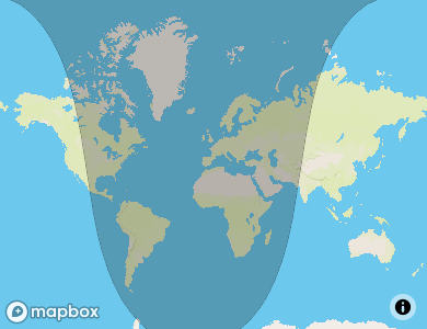
As I’m writing this at 8:47 PM, Oct 19th, 2020, there are roughly 4,036,211,821 people experiencing daylight. It consists of half of North America, half of Asia, and all of Australia.

I will use this library for my midterm project which is an interactive visualization of sunlight all over the world.

Time Sketch #3: Decimal Clock

I recently came into an article describing the origins why we measure time the way we do. There are 12 months in a year, 28-31 days in a month, 24 hours in a day, 60 minutes in an hour, and 60 seconds in a minute. Years, months, and days are defined through astronomical phenomenons, while hours, minutes, and seconds are relatively arbitrary. This gave me an idea: Why not make it decimal?

I’ve always been frustrated by the imperial measurement system. I have, and probably always will be, a metric man. 100 centimeters in a meter and 1000 meters in a kilometer, it’s clear. 1760 yards in a mile is unintuitive to say the least.

My idea is to make time work the same way. I’m not going to mess with year, month, and day because they are largely driven by astronomical events. I will, however, change the definition of hours, minutes, and seconds.

Here’s what I propose:

  • No AM/PM, it leads to confusions
  • 100 decimal hour to a day (1 decimal hour == 14.4 minutes)
  • 10 decimal minute to a decimal hour (1 decimal minute == 1.44 minutes)
  • 100 decimal second to a decimal minute (1 decimal second == 0.864 seconds)

This clock is a clock that simulates what it would be like living in a decimal world

Links:
Code
See it live

Time Sketch #2: Don’t Look at The Clock

Upon reading the first chapter of A Sideways Look at Time, I came across this concept of Kairological time. Regular chronological time is (for the most part) constant. It follows a standard set of ticks, moving forward constantly, unyielding. Kairolgical time is somewhat cyclical, it follows the flow of life, opportunistic.

I like this idea of living following a kairological time. It is an opportunity to be more connected in what I do. This past year has been a rush of adrenaline, I constantly worry about not having enough time to do what I want. I would look at the time constantly worrying that I’m taking too much time performing a certain task.

I realize that this is not healthy. Yes, there is a positive aspect to being punctual, especially in a professional context. However, constantly looking at the clock, letting myself be pressured by time, is not constructive for my creativity or mental health. Growth happens when it happens, it does not stick to a timetable.

I made a clock that moves faster and faster the closer you are looking at it. I used the webcam to estimate how close the user is to the screen.

This serves as a reminder to myself to give me the time that I need, instead of using the time that I have. Quality of growth beats quantity of growth any day.

Links:
Code
See it live

Time Sketch #1: Semi-early Clock

I grew up with a clock that is always ten minutes early. This was before the age of the internet, we only had one clock in the whole house. It was only at the age of ten that I realized that the clock was ten minutes early. When I asked my parents about it, they explained to me that they set it that way so that we were never late for things.

The thing is, once I realize that the clock is early, my mind started to compensate for the early clock. I was yet again late for things.

As an adult (or rather as someone with an adult body), I’ve fully understood that this method of setting a clock early doesn’t work if we are fully aware of how far early the clock is.

As a mini tribute to my parents, I made a semi-early clock. This clock will only sometimes be early. It can be anytime from not early at all to 10 minutes early. It acts like a regular clock, but when the minute hand moves, it might or might not move to it’s “accurate” place.

Links:
Code
See it live

Observational Instrument Ideas

Note: This is an ongoing document. I will add more ideas here as things come up

Daylight All Over The World

Time is the measure of change. When nothing changes, time ceases to exist. The sun rises, shining light onto a sliced portion of the earth that was previously dark. As the sun sets, an equally sized sliced portion of the earth goes into darkness.

Although the geographical area that is currently lit by the sun is more or less constant at any given time (let’s pretend there is one universal time), the number of people who are experiencing it is fluctuating (due to the geographical unevenness of the world’s population).

I would like to create an “instrument” that displays the number of people that are experiencing daylight at any given time.

Distilled Summary in Color

Time can be linear or cyclical depending on the scope we’re looking at.

Assume we’re following the gregorian notion of time. The hour of the day goes up and up, never decreasing. Except for at the end of the day when it goes back to zero again. The day of the month goes up and up, never decreasing. Except for at the end of the month when it goes back to zero again. The month of the year goes up, never decreasing. Except for at the end of the year when it goes back to zero again. But the year, it goes on and on and on. The buck stops with the year.

I want to create a distilled summary of each “cycle” (hour, day, month, year). One of the ways I can do this is to take a snapshot (picture) at specific moments of time. That picture represents the “state” at any given time. Ultimately, each snapshot can be distilled again to a single color (or maybe a series of dominant colors).

My plan is to take snapshots from a couple of public webcams all over the world over time, distill them, and display them in a series. Each “cycle” will have its own “summaries” which will, in turn, be used to “summarize” the greater cycle. Creating the color palette of time in a particular place.

Sirenes in New York City

New York City is extremely loud. We have police cars, fire trucks, and ambulances going around at all hours of the day.

My apartment is facing a pretty busy street (4th ave in Brooklyn). I would like to track how many vehicles with sirenes pass by my apartment over time.

My plan is to train a machine learning model to recognize a siren from a vehicle. I would then run it in a raspberry pi with a mic to detect each time a sirened vehicle pass by my apartment.

The final result would be a visualization of this generated data.

Half-Baked Ideas

  • Something with tracking kairological time in chronological time vice versa
  • Using flight tracking data
  • Something with git commits

Cuisines of New York

Background

New York City is special in that it has a rich history of immigration and diverse racial composition. Starting at the beginning of the 18th century, New York City has been the main port of entry for immigrants coming into the United States in search of asylum, new opportunities, and prosperity.

This trend of immigrant influx continued through the post-war economic boom of the 1950s and contributed to the rise of local ethnic businesses in New York. That spirit of immigrant entrepreneurship continues to this day.

Development

Originally, our idea was to map ethnic restaurants in New York City and find the contrasts and correlations between the racial composition of a certain neighborhood and the availability of ethnic restaurants. We started out by making maps showing the composition of certain races in each neighborhood based on the 2010 US Census.

Distribution of residents identifying as Hispanic in NYC
Distribution of residents identifying as White in NYC
Distribution of residents identifying as Black in NYC
Distribution of residents identifying as Asian in NYC

We then started categorizing restaurants based on their cuisine’s country of origin to determine which ethnicity/race does a specific restaurant caters to. We did our scripting in Node.js, so we created a map mapping each cuisine into a specific ethnicity.

As we do this, this starts to feel more and more wrong. Determining that a certain cuisine’s country of origin directly maps to the color of one’s skin is a gross simplification of something that is nuanced and full of history. Even though we started this with the best of intentions, we decided to not go forward with it. We decided to pivot into mapping the cuisine of New York City.

We created a few maps describing the current (as of May 2nd, 2020) state of the available cuisines in New York City.

All restaurants in New York City
All Brazilian restaurants in New York City
All Indonesian restaurants in New York City (there are only 9)

Going back to the idea of analyzing neighborhoods, we then made a map of the density of restaurants of a particular cuisine in each neighborhood. This is done by counting the number of restaurants in each neighborhood, divided by the square footage of said neighborhood. (numbers are displayed as restaurants per 100,000,000 square foot).

The density of Pizzerias in each neighborhood of NYC
The density of Bagel Shops in each neighborhood of NYC
The density of Coffee Shops in each neighborhood of NYC
The density of All Restaurants in each neighborhood of NYC

Finally, we moved forward and created a web map showing the most popular cuisine of each neighborhood, along with the number of restaurants of a specific cuisine that exists in each neighborhood. Each neighborhood is colored differently based on the most popular cuisine, and when hovered a popup displays the cuisine breakdown of said neighborhood.

Reflection

To me personally, when I think of the foods of New York, I think of pizza, bagel, and coffee. We find that it is interesting that the most popular cuisine in New York City is indeed Chinese food.

Another thing we found interesting is that the density of all restaurants in NYC inversely matches the density of Hispanic residents. We have yet to determine if this has anything to do with income brackets, education levels, or anything else.

One last note, we feel that it was important to go back to the drawing board once we realize that what we were doing was wrong. Pivoting was definitely the right decision. We encourage all technologists to periodically do a self-sanity-check. Just because we can build something, doesn’t mean that we should.

Data Sources

Professor Soir’s Escape Zoom

Professor Soir is a non-linear experiential virtual escape room experience that invites players to discover hidden information.

In this project, three players are given different roles as research assistants. They all work for Professor Soir. On the journey of working on their tasks, they discover certain information that requires them to work together and make the final decision together.

Drunken Walk Instrument: Part 3

I’ve made some updates to the Drunken Walk Instrument.

I’ve now included a knob on the side which controls the tempo of the music being played. Ideally, this functionality is better served with a slider, but we make do with what we have.

The LED on the main button now lights up in conjunction with the notes. Previously it is simply always on when a note is playing.

Previously, tapping up/down will make the chord move up/down by one-half note. This goes against the idea of a drunken walk where everything has a random element to it. Now, holding up/down will change the chances of the chord going up/down. The rules are as follows:

  • If neither up/down is held, there’s an equal chance of the chord going up, going down, and staying still.
  • If up us held, there’s a 70% chance of it going up, 20% of it staying, and 10% of it going down.
  • If down is held, there’s a 70% chance of it going down, 20% of it staying, and 10% of it going up.

Hopes and Dreams

  • Now that it got to this stage, I realized that the enclosure and tangible controls are not the best for this. I think something that’s close to a PlayStation/Xbox controller would work better.
  • Use an analog joystick instead of a digital one.
  • Adding a sustain button would be nice. Currently, all notes are sustained. A more granular control will produce better music.
  • Adding a mechanism to change the chord would also be nice. Currently, it only plays the major eleven chord, switching between that and a few other major chords could provide some variety.

Drunken Walk Instrument: Part 2

Since writing the previous post about my drunken walk instrument, there have been some updates.

Good things first

  • I’ve gotten to a point where the instrument is making the sounds that I want. This involves going through music theory tutorials and trying out notes here and there. Yay! (code on GitHub)That is really it, just the one oo
  • That’s it, just one good thing

Bad things

  • My joystick “broke” as I was playing with it. The threads on the two screw-holes that held it to the mounting plate broke off. Luckily, with some careful placement of hot glue, it now holds together. (I’m pretty bummed that I didn’t document this process, now that I’m reflecting on it, it actually was a genuinely fun thing to figure out). If it makes sense, I used hot glue to act as a plastic plug to give friction and to expand to the nooks and crannies of the joystick.
  • I just now realize that I want to have an analog control of the tempo. The thing to build for next week I guess.
  • Currently this only works with midi instruments that fade off like a piano. I still haven’t figured out how to send a note-off-signal asynchronously in Arduino. Maybe create a queue of notes to be turned off, then on a separate interval time executes the turning off of them?

Drunken Walk Instrument

The Idea

Over the past few weeks, I learned a little bit about general music theory. One idea about it that I found interesting was that although music is generally guided by a series of rules and structures, the brilliance of it comes from the fact that it is unexpected. This got me thinking if I can integrate randomness in music to create that level of unexpectedness while still adhering to a level of structural rules. Moreover, I want to have the user be able to have some level of control, not just pure randomness.

I fell in love with this idea of “directed randomness”. An intoxicated individual can a lot of times have an idea of where they would walk, where they would move their feet. However, due to their intoxication, they have random tendencies to sway here and there, so they can’t precisely move their feet to the exact point they want. I’d like to implement that idea in a musical instrument.

I created a simple (non-musical) sketch as sort of a reference to what I want to do musically. Call it a proof of concept if you will.

Since I think it fits well and that we’re all productionally-challenged at the moment, I plan to utilize an enclosure that I’ve made previously.

Joystick and button enclosed in a plastic box

Bill of Materials

System Diagram